
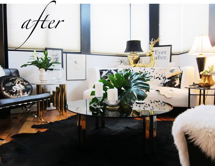
i mentioned HERE that i'd recently made some changes to my apartment. nothing major ~ simply subtle adjustments here and there. like i've intimated before, it's always evolving! to follow is a before & after comparison of my living room area. what do you think: better, worse or same old same old?!




153 comments:
I like it....definitely looks a bit more streamlined.
I am with Mary Ann (above), like it better now (not that it wasn't already gorgeous before).
xx
Better: cleaner with some pops of green. Well done!
Stunning, beautiful, I love it!
I definitely agreed. It allows the pieces to really stand out individually.
<3 Sarah
theantiquepearl.blogspot.com
i like how it was before, much more richer, although i do like the plants
hawi
http://lunchatbergdorf.blogspot.com/
love your blog
I like that you have plants in the room now. Greenery is supposed to bring happiness!
www.mintypeaches.blogspot.com
Not my personal style, however it is beautifully decorated down to the very last detail, so I can appreciate it :)
http://nella-luce.blogspot.com
always a big yes to live plants. your place is lovely
Love how you've changed the look completely with a little twitting.
it looked so luxurious before!!!! Now it is not as interesting and the green throws off the black/white/gold it had going on before. If you want plants in your home try the kitchen.
I liked the before so much more! So much more your style as well! The after is a bit bland.. so not Kelly!
Hmm...I like the one before a bit more, but I see why you'd want something new. It has a good base, but try adding some more decór to spice it up!
theramblesofafashionjunkie.blogspot.com
I really dont know.. maybe BEFORE was better, really interesting - AFTER is just normal flat with a lot of plants..
I'm gonna vote for after. I think the splashes of green freshen up the space and break up the black, white, gold colour thread nicely.
It's so fun to change up the pad!
So classy I love your taste.
Beautiful ;))
http://magmoiselle.fr/?p=4485
Beautiful ;))
http://magmoiselle.fr/?p=4485
I LIKED IT BEFORE, THE AFTER LOOKS CHEAP COMPARED TO THE BEFORE
Ah you are putting the winter away. I get your point about the gold, the same thing with me. These gold objects look fabulous in the dark winter months, but when it turns spring , you just want to put them away. The same thing with the carpet, the white stars remind you of snow. Plants are always updating your house and gives it a fresh look. The green really makes you longing for spring, so good choice. But where is that gorgeous ottoman from the Barcelona chair. Don’t put it too far away!!!! The glass vases and accessories defiantly gives you are brighter and clearer feeling.
it looks brighter for some reason! love your apartment!
http://fashionablenotebook.blogspot.com
the place looks absolutely fantastic.. i wanna move right in. i like the more scaled down look of the redone.
thanks for sharing
xx
both pretty cool. very similar styles. the latter's neater.
I actually like the before better. I think it was more classy and elegant.
I prefer your 'before' carpet. Love the new spotted drape on the couch. Does not the old carpet work with the spotted couch drape? The reindeer perhaps on the other side of the Ever After print. Perhaps switch the plants, the bigger one from this vantage point seems to overpower the other objects on your coffee table. It might look nice dripping over the edge of the side table. Change is great, I prefer both your before and after for different reasons. It is almost as if I cannot compare them, for they each have their unique charm and beauty.
Really beautiful; where did you find the ever after print? I love that even though you use neutral colours, the apartment still seems warm xx
http://velvetandtea.com
I like it better now. It's less cluttered and looks more spacious, also I love the plants. Plants always make a space more "alive".
Once again, very well done
after!!! so good! I love the ever after print and the plants. and that spotted thing on the couch! even the most perfect decorating can feel old & tired after a while. this is a nice update for spring.
It looks more fresh! Like if it was getting ready for spring!
http://carriesfashiondiary.blogspot.com/
Love the new greenery.
The green definitely freshens it up, but I really liked the old warm golden feel of it before. It's a nice change for spring, but I'm a bigger fan of the old decor.
Oh I love the touches of green! Perfect for the change of season :)
Better! I love the green and it looks brighter now. I like it:-)
Well done!! I think it´s better with touch of green... ;)
xx
http://meandmylifestyle.blogspot.com
it looks more luxe before, still cute but i liked the "before" better...
yes very glam!
Well Done Honey!
Now it's really perfect...and i really like the green touch!
Have a nice day!
(http://www.the-parisienne.com/)
I loved the original version when you showed it on here, but I actually like the after version better! It looks more inviting and lived-in with a little less gold and more green! (But still glamourous!!)
it's lovely! but i prefer the before one. u really hv a really good style! xx.
http://a-black-gold.blogspot.com
I think the splash of green against the gold really works, it looks richer.
nice & fresh with the plant !
http://modeinkiosque.blogspot.com/
I heart both...I believe the way it was first is the fall/winter collection and the new way with the greenery is the spring/summer...it's a little lighter, brighter, cleaner - just like the seasons! You go, girl!!!
www.OLGATURKA.blogspot.com :)
more streamlined and also seems to be welcoming spring! which is what i am doing with wishful thinking right now too!
it looks cleaner now, somehow. probably cause you're using plants and more white elements.
looooove it!
I prefer the before - so much more elegant and full of glamour
looks cleaner yes :)
http://pinklemonincrystal.blogspot.com
so much brighter and cleaner!! gooorgeous room. love.
http://wordbyjessie.com
i think this is a great look for spring and summer - very clean as some said above. then you could always change it back whe fall rolls around. i like them both.
http://lachapstickfanatique.blogspot.com
I def like them both, but the after photo looks more spring/summer ready :)
XoXO-Kelli K
http://thefashionworshiper.blogspot.com
I love the plants in the new photo - wondering if they're real - I would manage to have that thing shriveled and brown after one week in my apartment if it were real haha! Love it Kelly, looks great!
xoxo Emily
http://bellishment.blogspot.com/
the before and after are both lovely but I actually prefer the before
I would have to say I am torn between the two. I do like the plants tho and think it will be a refreshing change for Spring.
Gorgeous!
http://kimchicsisters.blogspot.com/2011/02/walking-down-street.html
Wow Kelly I like it so much better now! beautiful
www.theclassique.org
I like the new throw (on the back of the sofa) - the first thing I saw! I like how it almost blends into the couch except for those little spots. and the coffee table looks less cluttered. I like it a lot!
it looks cleaner but im leaning a lil towards how it was before to be honest. what did you do with the rug??? when you first posted the image i tried looking ALL over for it but no luck. let me know if you want to sell it by any chance!!
I think it looks ready for Spring, which is a good thing! I'm sure that November/December it will start looking ready for Winter again, right?
I like the new update! It's definitely a more fresh look, with lesser decor, which can draw more focus to the remaining decor.
www.TheFancyTeacup.com
much love.
Both looks are fab, but I personally prefer the "Before". I understand the draw towards greenery to usher in spring, but I guess I'm just not a plant person, lol. However, I could see calla lillies or white orchids working in this space. The leaves and stems would provide a touch of green and would fit right in with the sophisticated lines of your existing decor.
Kendra
Closet Confections - A Personal Style Blog
I like this clean, streamlined reorganization! And the plants are definitely vrey "spring" :). Plus, there's no point in a lving space that you can't keep changing to suit mood and season!
http://anna-gemutlichkeit.blogspot.com/
Gosh I hate saying this, but I like the before! I reposted the before pics on my blog when uou first feautured them... The after pics are...well, not glamorous...not kelly.
Switch it back to the glamourden love.
xx
E
The second one: más luza, más vida y naturaleza. ¡Me gusta! ¡Tiene mucho estilo!
¡Besos!
http://porqueelglamourestaenlosdetalles.blogspot.com/
Even without the comparison, I thought it looked a little frantic before. There were too many sharp edges, metallic verticals, and busy designs. I love the switch-up! It looks relaxing and the plants give the room a natural element that grounds it. I'd love to see another non-metallic element, like a sculptural piece of wood somewhere (even stained black), like a stool, perhaps.
Both versions are lovely and sophisticated. The overall effect of the changes, at least in these photos, is that the room feels slightly warmer and a bit more open and relaxed. The environment becomes more about the space now and the interesting relationships between the objects within the space. There's a subtle shift to a more peaceful mood. I love the way the organic plant forms echo the shapes of the new floor covering and couch throw. With the anticipation of Spring, the plants and the slightly pared down environment really seem to make sense. It's more tranquil, but still very glamorous.
I prefer after , more claen for the Summer!!!!
it looks great, i loved the previous rug but it was definitely looking a little busy, now it looks nice and cozy
www.indramaticfashion.com
I like the addition of the greenery and the fact that the rug is all one value. It's less busy now and less confusing for the eyes. But I'm definitely missing the tall curvy candlestick and the bust, they are so gorgeous and unique!
Cheers,
Natalie
Love it! Way to bring some "spring" indoors- very refreshing :)
The before. Much less midwestern. Animal skins are out. Looks like the trend finally hit Ohio.
I love them both, but the changes you've made are wonderful and brings some spring to the joint. Love the polka dot cow on the couch - that is so you!!
Very beautiful home! What happened to the fireworks carpet from before?
As beautiful as it did look before (genius design skills, have to say), I am a bigger fan of the new version. Probably because of the addition of plants, which I always love.
I like both of them. I like the before because it seems like an eccentric woman lives there, but the after is more organized. I like them both! Good job by the way!
Admit it, you got tired of dusting! LOL!! It looks lovely and refined. well done!
BEFORE! its so funky but classic! I like the AFTER if it were for someone older - but you are too funky, cute and hip ;)
I love the new layout. The the older one was more artistic but less practical. This one seems more homey.
Yasmeen
Castle Fashion
i love the new arrangement. Much cleaner and luxurious. Less busy. The new rug really allows my eyes to rest. Beautiful!
Definitely after! I dont know if the before shot was for a photoshoot, but it looked a little too "dressed" to me. After seems more inviting and livable.
Really beautiful I love the addition of greenery. xx
www.dragonnfruit.com
Everyone else who has commented seems to share my sentiments — both are amazing, but i do love how open and bright the after photo is. Castle Fashion mentioned that is seems more homey and livable, and I'd have to agree!
When you rearrange and change, what do you do with some of the items that don't make the cut? Do you move them to other parts of the apartment, put in storage, or donate/sell?
<3
After seeing the recent photos I was so inspired, thus I must say "before!"
have to say, i love this incarnation. it's just slightly less-cluttered and is really a room to sit back, relax, and enjoy the view in. (with a cocktail in hand, of course.)
It looks much lighter and airy now :)
I love both, but the "after" is better! XOXO, www.NatalyasCloset.com
Je préferais avant c'était juste parfait et plus riche au niveau du style. Merci pour ces belles photos.
I love that you added some greenery into it!, it gives it a bit more life! Though I think something gold maybe needs to be on the coffee table to balance it out. Love the new rug + cushions! Both shots are FAB! ;)
xoxo
Meg
lovely. But have to say, better before.
What happened to your fantastic rug? I like the changes but have been trying to find a starburst rug like your old one since you first posted your living room photos (now the "before").
As a design professor, I have to vote for BEFORE. Definitely. It was very beautiful, rich and artistic. Thank you for sharing your lovely apartment.
Definitely before. Trust me I'm smart.
It's much better. Not so crazy and cluttered feeling. It just seems more simple and put together.
Your house decor is phenomenal. I particularly enjoy the new layout; it's prepped for spring and summer lightness! I love how your apartment goes through seasons, just like our wardrobe does.
Hmm...the "after" looks softer and lighter (like), but the area rug from "before" seemed to work better with the space.
Um, are you selling that rug, by the way?
Tamia
TheStyleSample
I love them both, gorgeous
http://bespokerose.blogspot.com/
This is dope!
www.therealpartyoverhair.blogspot.com
I love your blog so much! I'm a bit of a diy-er myself so I love seeing how a texas girl lives and decorates in the city, and tend to get inspiration from your posts. You even inspired me to try to start my own blog!
Missing the rug from the first image but overall I prefer the second. I agree with the streamlined comments; it allows the eyes to rest and to actually *see* all your interesting troikas & such. Thanks for sharing!
Personally, I like after because the plants put some life into the room and the green adds a bit of dimension to the monochromatic shtick. Plants always make a place look lived in and alive, because at the very least, someone has to be there to water...
So it depends what you want out of your place: perfect, matchy and sort of haute austerity, or well decorated, personal and cared for?
I like both! i do prefer the other rug :)
I liked it before, sorry. It just looked more old hollywood glam. But I love your decorating as much as your wardrobe!
Oh wow your apartment is gorgeous! Really shows your personal style. Looks like one of the photos from "Ellements" book. PS! Love the new carpet, adds more simplicity!
Actually I like both versions, there's some elements that I prefer on the first picture and others which look better on the second. One is sure, it represent your personal style! Well done :)
Virginie/ Couture & DIY
Looks better now. More relaxed and less hardcore lol
www.nicolelikes.blogspot.com
I think flowers make it more comfly. Now it looks that room can breathe better. Thumbs up!
The before looks chic and winter-y; the after looks chic and spring-like. Double win.
I like both, but I have to be honest. I think the before photo has a lot more interest than the after photo. There are more places for your eye to fall, and the rug gives it a pop.
http://thoreausdaughter.blogspot.com/
I REALLY liked how it was before! Very chic!!! Now it's kinda boring and I don't like the white and green combo. It's nice to have plants, but maybe you should try some smaller flowers.
i thought it couldn't get better, but you proved me wrong! I think the rug made a huge difference.
Amber
Ambersmouthwash
ps come stop by my blog! I just returned from Paris!
I like the first one better. I like the idea of plants in a living room, but something about the green throws everything else off. I would suggest white or light pink orchids set in a bunch of three and but in a white or black container/planter. That will soften up the room a bit but still look quite elegant.
wow your apartment is amazing love it
let me know your thoughts on my new blog entry and follow me at:
My Couture Diaries
My Couture Diaries
My Couture Diaries
DEFINITELY BEFORE!!! Not that after is bad per se...but the before was MUCH better in my opinion!!! But all that really matters is what you like! :)
michelle
I personally like it much better BEFORE. I think it lost a lot of touch and glam. Sorry.
I think it's so much more fresh and has more light now!
http://hereinmylife-paula.blogspot.com/
I prefer the after!
xoxo
I'm with everyone who prefers the before photo, with the exception of: the new rug (love it), the fur on your chair in the foreground, the blanket on your couch, and the removal of the overhead lamp. The before shot is so much more natural and interesting to me. It is more eccentric while the after is more strategic and lacks it's previous charm. I dislike the plants. They are just too green for that elegant, neutral room and throw it off for me. Just my two cents though they are both nice options!
So curious as to whether you moved the first rug to another room in your home?
it looks great!! love how the plants bring a hoole other vibe to the room! it was awesome bafore, but after.. waw!
ps:just wanted to congrat you from Brazil! i love your blog
sorry, but i'm going to have to say worse! the blocky green & white is tacky!
it looks pretty to look at, but not fun to sit in. looks too perfect/ a guest would be scared to mess something up. looks like the person is trying too hard to please others who see what they have. i'd like a more relaxed feel.
definitely, most definitely after. Before, although opulent, is a bit cluttered..almost has an effect of trying too hard whereas the after is effortless and more relaxed..like you!
As an Architect and an interior designer, I have to say that you definitely did well styling your place the first round, but I think the after is so much more sophisticated and stream-lined. The addition of greenery is a nice touch to the black/white/gold palette (adds life to it). It was too busy before and your unique pieces didn't stand out as much. Editing is always a great idea and you can have glamour without going over the top (Mies Van der Rohe did say "less is more").
Nice work, my friend!
xom
Before>>> Winter
After>>> Fresh spring style
Welll done!
xoxo
I like the after! Edited more and I like it a little less cluttered.
I think it looks more "normal". before it looked very kind of editorial. as where to live in, i would choose the "after". but both are superb, of course.
♠ ♠ ♠
www.APARTMENTTWENTYTHREE.blogspot.com
Love the print "ever after". I wish I had an awesome place to decorate and a paying job. Gee, that would be nice. Haha.
Your place looks gorgeous. I actually liked a little bit better before--I like the idea of pretty knickknacks everywhere--but I also understand the need for change sometimes.
Also--Congrats on the Lucky Mag feature.
Hi Kelly! You have impeccable style- I think they both are great looking. I do like that you've added some green to the living room- looks right at home =) I just recently re-did my casa as well...
http://www.bluebonnetsforsal.com/
Hello Kelly,
I really love your apartment - I have scoured all the photos on your blog for interior inspiration!
I share your passion for brass and gold trinkets...I think executed in the right way can look very expensive and not at all tacky. Too many people are scared to include this in their interior for this very reason. Please keep uploading photos of changes improvements you make,,,,I think you have a ver large and admiring audience! x
http://ivorycrush.blogspot.com/
love the changes. very cute for spring.
Change it back to the before pic!!! i really loved the high-style-glamour look;)
- Josie
i like both for different occasions/seasons/variety.
i appreciate the simplifying that's taking place, but the first had more VERTICAL elements, which i think are necessary when all the furniture sits low and the architecture reinforces it.
i really loved how that single, burnished gold candle stand broke the architectural horizon line. the brass tones are especially warm and pleasing in winter.
you have a wonderful opportunity to introduce and trade out various accent colors (brass, green..?). and those items could take focus in an exciting way.
or you could do a majority of white for spring.. always fresh.
the before felt complete in it's statement, and the after is quite nearly there? i think the coffee table wants more of a moment.
always an inspiration, and food for creative thought, thanks!
-kat
just keep the deer on table. i rhink it looks better that way.
I love the before as a winter look and the after is more of a slipping into spring look. You have impeccable taste.
Floral/greenery arrangements always make a space seem more inviting and alive. And certainly a nice touch considering It'll be Spring tomorrow for you.
The black cowhide rug is much subtler than the starburst rug. This means the visual emphasis is more on your lovely decorations instead. Also the cowhide has a smoother texture and looks less "woolly" and much more Spring.
Enjoy the beginning of Spring in your fresh Spring space.
I love your interior decoration photos. I always find them inspirational. Please keep them coming.
Beautiful decorated, it looks more cleaner now and love the green accents!
xx.
lescheveuxblondes.blogspot.com
It almost looks like a 'winter' and 'spring' difference - the second scene looks fresher whereas the first one looks warmer.. Hope that makes sense, it is meant to be a compliment!!!
i like very much your apartment!compliments! :)
both ways! before looks more wintry and the new shot looks ready for spring!
way better before-was more glamorous
It looks less busy for sure, simpler, which isn't my style but I can appreciate it! ;] As always, you have great taste.
I like that you put the gold statue of the elk?raindeer? (can't really tell what it is :P ) in the back. it felt a bit too big to be standing on your coffee table, I think that it goes much better with the feel of the room when it's behind the couch :)
And I loveloveLOVE your lamps!! :)
trust your first instinct, the 1st layout is such a great consistent expression.
bosselimited
Love them both!
I absolutely love the house tour posted a few weeks back, and fell in love with your apartment and decorating immediately. But, I have to say, that I really like the redesign you did! It takes some of the "weight" out of the room and looks much cheerier and cleaner, with the bright pops of green. There's a little less black and more color. Well done!
XXXO
M
http://tastesandstyle.blogspot.com
i like the after more -- brighter, less cluttered, in a way, I think, more tasteful ---- but, I think it would look even better now without the black rug, or any rug, underneath. the wood floor would compliment the bright whites and fresh plants. maybe change the black lamp shade at the back to a white, too. so lovely, though! xx
Homg, your apartment looks AMAZING! Killer style!
www.thewallflowerstyle.blogspot.com
BEFORE <3
you've got such lovely elements so both styles are great. it's always fun to rearrange things. it gives new life to pieces that you might have had for a long time. my room seems to be in a constant state of change. seeing this makes me so excited to graduate and start restyling homes allll the time!
i love how the after seems so whimsical too. (the "ever after" print is probably my favourite part of the entire space.)greatstuff
You, your jewelry and your home are stunning! I love how organized your studio is (as a Professional Organizer). Great job on Nate! So glad to follow your blog.
Both classy, but the after def has a cleaner, fresher feel to it. And there's still enough of the gold to bring warmth.
Hi, I've just discovered your blog and can't get over how similar our taste is. I see how your before was a tad more cluttered than it is now - so in that respect it is better, but the black rug is, for me, a little too stark. I like a printed rug so I vote 'before' but with perhaps a little less gold and more greenery.
Gold seems to go with everything.
Post a Comment